Do you know what is the most common type of theft in the world?
No, it is not the theft of cell phones or wallets… But in fact, the theft of data! And that results in a huge loss for companies. A global study recently launched by IBM, which analyzes the annual loss per company, shows a loss of U$3.8 million per year. In Brazil, the reality is not that far away, considering that the average cost for cyber breaches in the country is R$5.88 million per year. It’s even more alarming to know that, in the Brazilian scenario, 85% of Brazilians have already been victims of online fraud or know someone who has experienced at least one type of cyber fraud. I have already fallen for this type of scam, people in my family have experienced it, and you certainly know someone who has been the victim of some kind of cyber-crime scheme.
The internet is already a part of our lives, is present in practically all segments of it, and for that reason, is almost impossible not to face situations that could be threatening to us, users – whether or not we are aware of these threats. It wouldn’t be a mistake to claim that very few people understand the risks involved in the security steps; and even worse, they don’t always really care about these risks. People are more concerned with the speed and quality of the access to a particular website, or with being able to pay a bill through the bank’s application without having complications, for example. Thus, we realized that the user’s interest is practical: He wants to successfully accomplish his task by reaching his goal promptly.
And this is where design comes in! But, what does this have to do with design?
As a designer, I joined Tempest in early 2019, and in this way, I also entered the world of cyber security. So, I started to develop products thinking about security; which, for me, is still a different part of technology than what I was used to working with, in terms of project and product development. And that was how, one day, I heard from a co-worker that usability and user experience go in the opposite direction of security.
As a user of this wide network – and also as a researcher – I tried to understand people’s behavior through security steps in the digital world and (many) boring checks, such as: The experience of logging in. Have you ever wondered how many times you have to do a login during a day? How boring is that? The consequence of this, of course, increases unsafe behaviors, when, for example, most users choose to use the same password in different applications. Which makes it all the more serious when the person chooses to write down the password on a post-it leaving it accessible and vulnerable, on their work area, which can be in a physical desk, or on their computer desktop.
However, there is no point in blaming the users, we – the people who develop digital products – have an obligation to make the systems safer for them.

As much as it may actually seem that usability and user experience are opposed to security, the three can and should go hand in hand; especially in a world that is getting more and more connected and full of virtual traps, like ours. We also have a very important role as guides and educators, when people start using a digital product or service that was built by us.
How can we design the user experience with security in mind?
Well, a project is not the exclusive responsibility of the designer, there are other key people involved from the beginning to the end of the process: Product owners, developers, scrum master, security analysts, among many other professionals. When we create the awareness that we need to develop a safe product, we have to think about security from the planning of the features by the designer to the coding. The focus on security is not punctual, it must be present in the project from day 0. When we build a safe product for the user, we are also assigning security and less damage to the business.
There are many tools that can help us think about the entire journey of using the product. However, first, we need to understand some basic questions: What are we trying to solve? For who? What is the context in which this person is inserted? And then, from there, you can deduce your mental models and design a safer experience.
Let’s do it step by step…
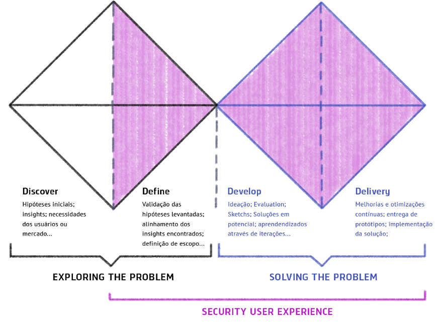
Aiming that our questions could be illustrated with real work experiences, I chose to use as an example for this article, a project that arrived in the hands of our engineering team for code refactoring and re-design. As soon as they passed this project on to us, it was noticeable that we could improve the user experience and refine its value proposition. The product in question already existed at Tempest as a solution focused on assisting the management of corporate e-mails that may be associated with leakage of sensitive data. I will bring some examples related to EIM – E-mail Incident Manager – throughout the text, which will have, as of now, the visual model of Double Diamond (in this case adapted to the inclusion of secure development):
1. What are we trying to solve / discover?

If you work with a product, you have certainly encountered one of the following situations: A- the customer has already arrived with a formulated idea; B- a market need was identified; C- this idea came from feedback from a customer, etc. These are just a few of the many trigger situations for starting a product. As soon as we are introduced to the project, we begin a major search to see if this idea makes sense; does it already exist on the market? If so, who are the players? How can we try to be different? And these are just some of the questions that guide us. From this moment on, we are opening up possibilities for the idea to become something attainable. When we know in which context and part of the market the product will operate, we can begin to try to understand people’s behavior and map out the most common threat models. In this next step it is important to have a safety analyst on the team, so that he can prioritize safety in the project from the beginning.
Below are some tools that can be used for this discovery step:
- Brainstorming
- Immersion
- MVP (minimum viable product)
- CSD Matrix (certainties, suppositions and doubts)
- Value Proposed Canvas
2. Know your user
Now that we already know what we are trying to solve, we need to know better who is going to use our product! This is the most important step in achieving a security solution suited to the scenario in which we operate. When we know our audience well, we gain very important insights into the possible threats to which the user and the system may be exposed. That way, we can better design the safety steps, as well as think about the tradeoffs between the headaches and the risks in the journey of use.
To measure the frustration and delight criteria in the user experience, we must consider the user’s entire journey including the login process. To know your user is to go beyond what was said in an interview, or what was extracted from a database. It is also trying to see the whole routine of use from those involved, as well as the human factors. People of different professions will have different backgrounds, focuses and routines. We have to understand that the product we are proposing is one more action to be carried out on a daily basis, increasing the work burden for our user. And yet, we are responsible for encouraging users to have a safer behavior and thus guide them on this journey. Therefore, I’ll say again that making an application safe is the task of the developer, and not an obligation of the person using the product.
If your product is already on the market, and you want to improve the user experience when related to your security steps, you can extract some UX metrics, even through Google Analytics, such as: How many security messages are being viewed? Which error, related to security, is the most recurrent in your application? What is the most visited page on your site? Failure to measure this type of data results in losing essential information full of details and insights that only tools like these can bring to us.
Next, we have some tools that you can use to find out a bit more about the people of interest (key people):
- Interviews
- User Journey
- Google Analytics (Do not underestimate the meticulousness of these metrics)
- Surveys
- User shadowing
3. Developing from Mental Models
Mental models also speak volumes about, who are the people we are trying to win over. So, this topic deserves a highlight in this article.
When we design experiences, we need to rely on the living of other people and learn from it. Only the user can tell whether a designed experience is effective for him or not.
Mental models have a direct influence on the effectiveness of the user experience, as they illustrate the way we see the world, as well as the ways in which we internally represent the reality around us. We must, therefore, take into account the culture, the background, the generation (age group) to which the individual belongs, the social environment in which that person grew up, among other things that influence when making a decision. Thus, we can see that users use their mental models to predict what’s to come.
Want a practical example? When we see a padlock before the URL of the website we are accessing (see image below), for some people this padlock refers to protection, reaffirming to the user that he is safe on the site, when in fact, the padlock only represents that the page has a valid SSL certificate, and unfortunately, even a malicious page can obtain one of these certificates.

“Mental models are based on beliefs, not facts: In other words, it is a model of what users know (or think they know) about a system or website ” – Grupo Nielsen Norman
For this very reason, they give us very important inputs on how we can design for a certain type of audience: What affordances (visual references) and what type of language should be used. These factors are the real motivators behind user behavior, and to design safer products, we need to influence and teach people to behave safely by default.
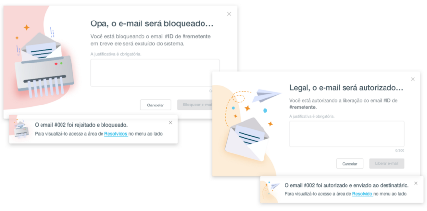
Bringing back to the example of Tempest, EIM has as its public managers from a multitude of different areas of IT or security: Finance, accounting, human resources, audits, etc. Because it is an audience that distances itself from the IT field, the entire language of the product was designed with the intention of removing the frightening technical security terms; in order to better translate the importance of taking action by these users, making evident the consequence of each action. Next, we have two images that reflect this concern and use a more common language to speak to this audience:

Below we have some tools that can be used to understand mental models:
- Mind maps
- Cognitive maps
- Concept maps
- Card Sorting
- Personas and Archetypes
4. SUX (Security User Experience)
Security User Experience, which Jared Spool affectionately calls SUCKS, is the first experience. Before worrying about whether the product will be mobile first or content first, what we have to worry about, in fact, is security. It is in security that the user will bump first. Because when he finds his first barrier, he will have to choose whether to adopt safe behavior within the application or not. Thus, it’s essential that the following steps are well planned:
- Identification, authentication and/or authorization
You may not have stopped to ask yourself the difference between identifying the user, authenticating and authorizing, also known as Access Control (which includes the audit process, but that is not the case at the moment).
Identification is when the user tells the system who he is (usually with the username, or email in some cases). For example, when you access the Amazon website (if you have a registration) and are already automatically “logged in”, it means that it has already identified you. However, if you attempt to make a purchase or add an address, you will be redirected to the authentication and authorization steps. To ensure that you are really the user identified by the system. Authentication is when we ask the person: Are you really who you’re telling me you are? Prove it! And there comes the second factor of authentication (2FA), biometrics, etc. Authorization is when we define what permissions a person has within the system.
I can even mention an example of this through another Tempest product called Al-lowMe. It helps to identify suspicious activities, through the analysis of navigation behavior, identification of new devices and geolocation. In case of any suspicious behavior, an extra authentication step is requested.
The separation of these 3 moments: Identification, Authentication and Authorization gives us more flexibility in terms of design to create more pleasant moments in the user’s journey. The question for this moment is “Are we identifying, authenticating and/or authorizing the right people, at the right time and in the right place?”
Threat situations and security perimeters
From the moment we know who the users of the product are, we already have a lot of information about the possible risks to which these people are exposed, for example: If the product goes to a bank, we know that users may be exposed to specific types of bank fraud, since this is, obviously, a completely different threat context than a user who had his Twitter account hacked. The focus at this stage is to maintain a constant dialogue with the security analyst or responsible engineer, as he will know, more than the designer, where the most common and / or most critical vulnerabilities are. This is where the possibilities for interactions and distribution of security perimeters should be discussed.
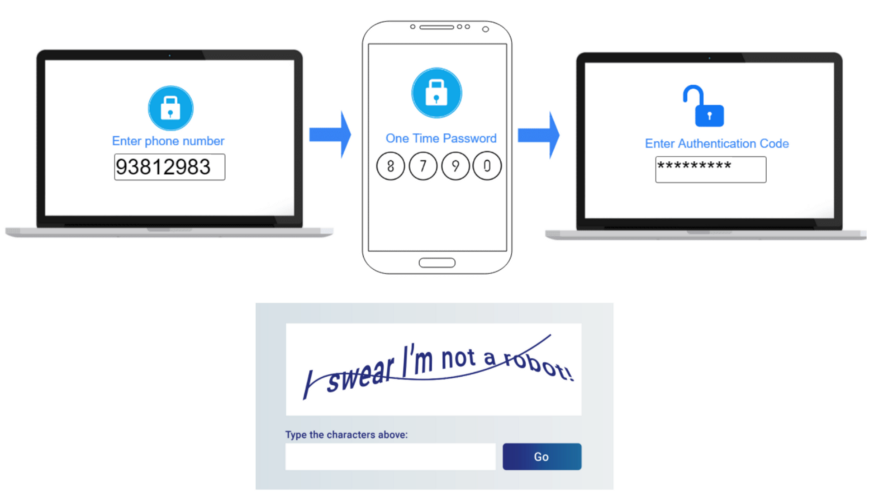
It’s not necessary to authenticate the user for every action that he’ll perform, being able to request an extra layer of security only at the crucial and relevant moments of the journey, so that we can give a certain level of freedom and navigation at other less critical moments, in terms of access to critical data and information. The following image illustrates some examples of the most common protection layers:

- Different products need different security levels. Here we have to be attentive to remember these perimeters in the journey of use: Login, authentication (whether or not a 2FA is required) and security authorization, require a great effort from the user and it is necessary to consider them in the journey of use. In a user story we often say “the user perform the login into the Y platform” as if this action were trivial, but it is not. Logging in can often be an extremely frustrating experience, and can even be the deciding factor for a person to stop using your product.
- Reduction of the user’s cognitive load. The cognitive load happens when a person needs to learn something new to perform a certain task, such as: Being faced with many choices on a particular website / app; or having doubts about what is written (lack of clarity). All of this impairs the user’s understanding and decision making.


The two images above illustrate this difficulty in clarity. In the first image we have the mixed sizes, between the numbers and the representative letters. In the second, which looks more like an elevator panel, we have an arrangement that is completely out of the expected standard of ordering, which causes not only strangeness, but also a visual confusion that, in fact, makes it difficult to read the information.
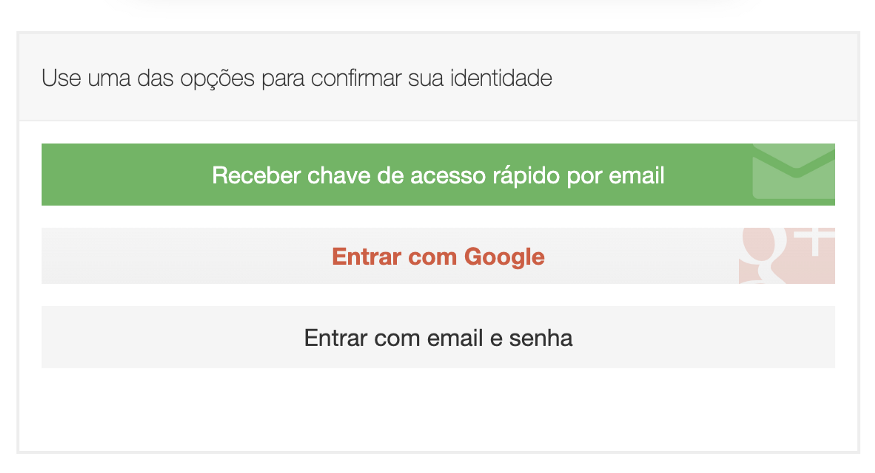
To avoid problems in the path of the user of any system, we need to make this journey as fluid and natural as possible, always adopting solutions that will cause less frustration when compared to the risk assessment. We must think of ways that will minimize this cognitive effort, for example: What can we do when the user forgets his username/login, password, or even when he tries so hard to access and ends up blocking the account, the simpler it is the choice of a solution for the user, the better:

Solutions must also follow what we call Safe by default. We don’t want the average user to be unprotected in our system, even less that he wastes time on security settings that he doesn’t understand. Therefore, less is more. And, it is worth remembering that:
“People ignore designs that ignore people” – Frank Chimero
Concluding
The development of digital products and services has long separated security analysts, designers and developers. This reality should no longer be part of our work routines, given the context of connecting the world in which we are inserted.
Establishing dialogues and exchanges between these professionals is essential for great solutions to happen. The responsibility for a safer digital world is ours.
“User experience design isn’t a checkbox; you don’t do it and then move on. It needs to be integrated into everything you do.” — Liz Danzico
We must then, teach and lead our clients, reduce technical terms for those who are not technical, use and abuse affordances and heuristics that belong to the mental models learned in research and, whenever possible, embed security in different layers of the system so that the concrete experience of the product is more fluid, and consequently, that security depends less on the end user.
When a solution has good usability, the user makes his decisions with more confidence. In this case, knowing what I am doing has a fundamental role in encouraging safer and more conscious behavior.
“If it’s not usable, it’s not secure!”
– Jared Spool
(Founder of User Interface Engineering)
